What You See, What You Know
Daniel Hornsby on how drawing influences his writing practice
Readers, we have a special treat for you this week. Daniel Hornsby, author of the delightful, strange, funny, sad, and profound novel Via Negativa is this week’s guest. Besides writing one of the best books I read this year, Daniel holds a Master of Theological Studies from Harvard Divinity School and an MFA from the University of Michigan. His work has appeared in the Los Angeles Review of Books, The Quietus, Joyland, and The Missouri Review. In this essay, Daniel discusses how he uses drawing to help inspire and shape his writing. Enjoy!
What You See, What You Know
Daniel Hornsby
Before I was born, my mother, a talented visual artist, taught high school art in rural Indiana. You could find her in the classroom discouraging students from painting puppies, sunsets, and Jimi Hendrixes (the great, inexhaustible subject for stoner teen artists, their Madonna and Child). After my arrival on Earth ended my mom’s teaching career, me, my sister, and my brother became her students, and early on she instilled in us the fundamental technical maxim of drawing, one you’ve probably heard before: “Draw what you see, not what you know.” A directive that runs directly counter to the literary adage “write what you know.” Eyes are not football-shaped. Teeth are rarely distinct as individual squares or oral tombstones, nor are they usually white. That sort of thing. This is a bit of scaffolding so that later, as you develop your own sense of style, you can forsake visual clichés, or at least be aware of them. The idea is to really look at something, to stop absorbing the rote notion of what your subject is and encounter it yourself, to really see it.
When I was twenty and starting to take writing seriously, this “what you see, not what you know” maxim gave me permission to avoid cliché at all costs, gouging out all “piercing blue eyes” from my stories, surgically removing any heart that skipped a beat as the action picked up. Since then, this notion has shifted somewhat. Now I see that writing and drawing meet each other in a space of conscious reduction of experience to different kinds of lines. Still, over the past ten years I’ve taken up drawing whenever I’ve come across a tough creative problem that demands I reorient my view of a project. Drawing (doodling, really) has increasingly become part of my process, especially for novels. It helps me in two very different ways. The first, and most important, has to do with ideas and structure. Sometimes it is a map of ideas that need to touch each other but can’t be worked through in a linear way. In other cases, it gives me a spatial understanding of character and action and lets me sit inside the world of a project without having to do anything.
Virginia Woolf is the queen of the elegant geometric abstraction when it comes to novels. Her famous “H” in To the Lighthouse is, for me, a kind of magic rune for thinking about structure. If you need a quick refresher: the first, upright column of the H is the slow unfolding of time in a single day, the H’s lateral rung is the ten-year “Time Passes,” and the final column is another single day. (This geometric mysticism shows up in the sentences, too: “All the being and the doing, expansive, glittering, vocal, evaporated; and one shrunk, with a sense of solemnity, to being one’s self, a wedge-shaped core of darkness.” Fuck.)
This temporal H was incredibly helpful to me and thinking about how to structure my first novel, Via Negativa. My narrator, a septuagenarian priest, has an active past, which, in keeping with his favorite theological tradition of apophatic theology, he is in denial about. I needed a way to organize the chapters in his past and think how they would exert themselves on the narrative thread in the present. I wanted an H like Virginia Woolf’s, and I looked for a structural geometric symbol in my draft. I found my way in through a short chapter I’d written on labyrinths—not the Borges variety, but the kind used in contemplative prayer, a walking maze that forces a meditator into a meandering loop that jukes them away from the center before it finally brings them there.
The past here is represented by cardinal points, and the narrative is the purple snail shell, which passes each past event superficially, circles back for another lap that goes deeper, and then ultimately arrives at the dark core of his pain. (This is akin to Nabokov’s opening image in Speak, Memory, I’d realize later.) Novels are hard to carry around in your head, and these geometric shapes and idea maps give me a framework that can absorb new threads, working them into an image I can always come back to when I lose my way. In a recent review of Friendly and Wainer’s A History of Data Visualization and Graphic Communication in The New Yorker, Hannah Fry concludes, “The invention of graphs and charts was a much quieter affair than that of the telescope, but these tools have done just as much to change how and what we see.” I think that, at least for me, drawing helps me “see” a novel project as a whole, outside of the linear experience of reading. (I should also give some love to my partner, the essayist Alice Bolin, who draws a lot of charts for the ideas in her work, and to John McPhee, whose writing on structure has lent me a lot of insight.)
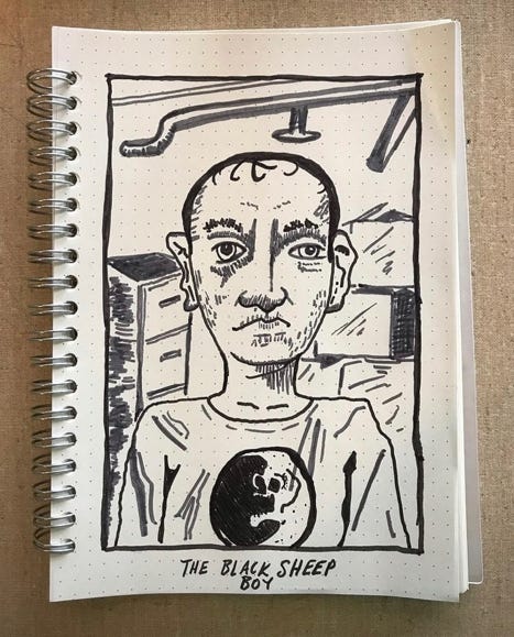
The second kind of drawing in my process is more straightforward. I might draw an interior or create a portrait of a character in order to gain a little more sense of a scene or spatiality. Here are a couple of these drawings, which are much more grounded than the H, labyrinth, or web. The first is a portrait of the punk label founder/billionaire scion narrator of my second novel, Sucker (yes, he’s wearing a Dead Moon tee), andthe second is an illustration of a scene in which his rich dad’s zebra destroys a surveillance drone:
These open up another mode of thinking, allowing me to sit beside my ideas without having to solve them (and keep me from checking my phone). Often while drawing, I get new ideas for exchanges, images, or characters’ memories. And, just like the with the idea maps, if I get lost, I can flip back to my dim illuminations and remind myself just what my project is.
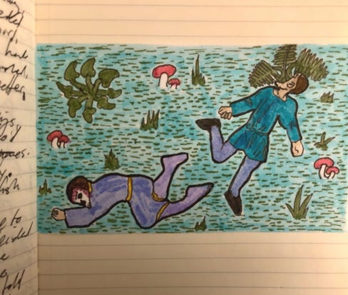
My current manuscript, for what I hope will be my third book, is set in the fourteenth century and plays with human-plant hybrids (the Green Knight, foliate heads in architecture, the Green Children of Woolpit). While working on this, I copied a bunch of manuscript illumination and marginalia, and after doing this over and over realized that many of my themes, in this case the tension between architectural and vegetal motifs in the middle ages, were everywhere in medieval art. I began to copy some of these characters from the marginalia and repurpose them as illustrations for my draft. (I’ve also included an ideas map below, just to show you what that might look like for a different project.):
These medieval manuscripts remind me that the separation of words and images in print culture is pretty new, and that for much of the history of writing, words and pictures aren’t so easily separated. Kids intuit this. Writing and drawing are learned together, and children are eager to combine the two in funky, experimental ways. That must be part of the satisfaction for me, the way drawing takes me back to my mother’s first lessons in seeing.


